Below steps will help to create multiple axis charts in excel.
Create an Excel as below: (here using excel 2007)

From the above data, we would like to create a chart such
that, each players score in each match is listed in stack, and their average
score is marked with a line chart.
Let’s see!!
Highlight from Cell A1 to G5 as below:

Click Insert -> Column -> 100% Stack Column as below

It will display as below:

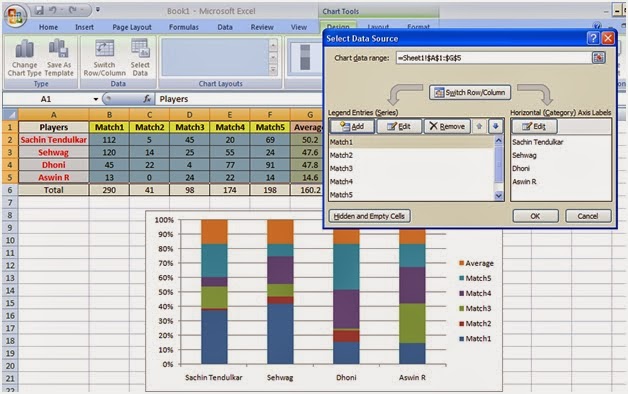
Right Click the chart -> Click Select Data as below:

It will display as below

Now, click Switch Row/Column in the above screen. You will
get below screen:
Click OK in above screen.
Now, Right Click the Orange color (which is for Average) as
below. Click Change Series Chart Type.. in below screen.
 |
| Add caption |
Now, select “Line with Markers” as shown below

Click OK.
It will display as below:
Now, Right Click the Line (Orange Line for Average) in above
screen -> Click Format Data Series as shown below

You will get screen as below

Change the Axis to “Secondary Axis” as shown below.

Click Close.
You will get below screen:
Now, Right click the orange Line (Average) -> Click Add
Data Labels as shown below:

You will get below screen:

No comments:
Post a Comment